Empathy focused.
My team was approached to redesign the order tickets used throughout wealth management.
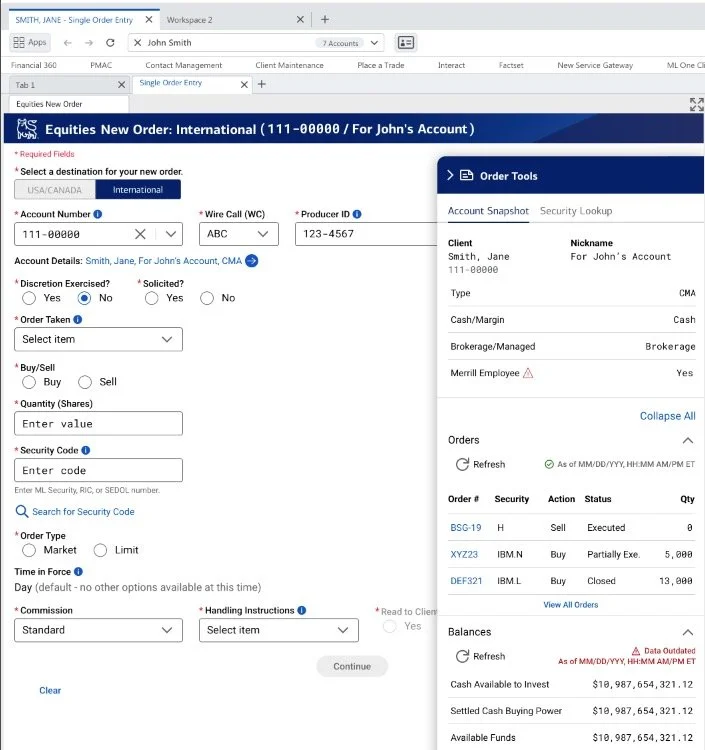
Problem: The order tickets for all of our different investment types had an outdated interface which wasn’t easy to use and prone to errors.
Solution: Understand the needs of our advisors and how we can enhance the tickets while modernizing the front end and back end.
We began by conducting user interviews and investigating the industry standard. We mapped current user flows to understand where frictions existed that we could address in the new design and spoke to users about what was most important to them.
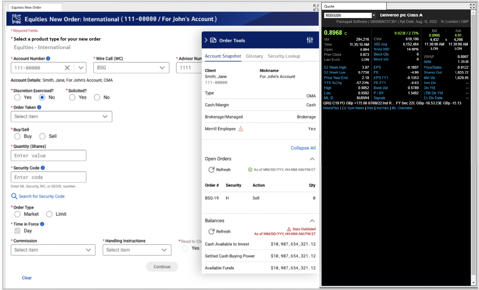
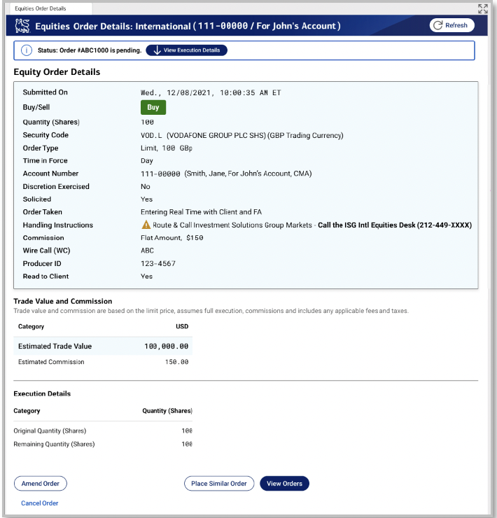
We designed a modern, easy-to-use ticket and used best practices in form redesign proven to decrease cognitive load and time to complete tasks.. We received a lot of positive feedback from users, but we continued to do user testing to ensure that it worked with the advisors’ monitor setups and how they flowed through the ticket. We also introduced new error patterns to identify errors before they happen.
We worked within the style guide defined at the enterprise level, but were able to get modifications approved to decrease scrolling and clicks for the advisors. This design was used as the basis for updating every other ticket on the platform. While each ticket has required its own research and specificity, these design elements served us well through each iteration.